dwell Student Living is a purpose-built student accommodation in the UK, Australia, Korea, Singapore and the USA.
Project
dwell UK Student Living Website
Design Team
Lead UX Designer & Supporting UI Designer
(my role)
Lead UI Designer
Tools
Adobe XD
Adobe Photoshop
Miro
Duration
3 - 4 months
[ Background ]
dwell UK has a working website that allows students to browse and book their accommodation online. Their goal is to improve the user experience on their existing website to better showcase their accommodation and retain browsers.

[ The Challenge ]
To improve their existing website so it allows students to browse and book their accommodation efficiently.

Discover
[ Discover ]
Users
The goal here was to find out who are the people using the website and what each user is looking for based on available information gathered in the discover phase. Potential dwellers make up the majority of the people using the website.
01
Potential dweller
[ Information user is looking for ]
Booking | Rooms | Facilities | Information on Resi-life | FAQ | Contact Page
02
dwellers
[ Information user is looking for ]
Log in | Information on Resi-life | FAQ | dwell App | Contact page
03
Parents or Guarantors
[ Information user is looking for ]
Booking | Rooms | Facilities | FAQ | Advice for parents & Guarantors | Contact page
04
Job Seekers
[ Information user is looking for ]
Career page | Team page
[ Discover ]
User Personas and User Journey Map
Due to time constraints, not all user personas and journey maps could be created. The focus was on the main users who are potential dwellers. They can be further broken down into decisive and undecided potential dwellers.
User Persona One: Decisive potential dweller
![Google UX Design Certificate - User Journey Map [Template].jpg](https://static.wixstatic.com/media/e28256_ab986fc3e55b44328f7d83c3e79e357d~mv2.jpg/v1/fill/w_814,h_458,al_c,q_85,usm_0.66_1.00_0.01,enc_avif,quality_auto/Google%20UX%20Design%20Certificate%20-%20User%20Journey%20Map%20%5BTemplate%5D.jpg)
User Journey Map one: Decisive potential dweller
![Google UX Design Certificate - User Journey Map [Template] (1).jpg](https://static.wixstatic.com/media/e28256_ace1baa3a32f4595823a0a28dd4fc828~mv2.jpg/v1/fill/w_814,h_458,al_c,q_85,usm_0.66_1.00_0.01,enc_avif,quality_auto/Google%20UX%20Design%20Certificate%20-%20User%20Journey%20Map%20%5BTemplate%5D%20(1).jpg)
![Google UX Design Certificate - Problem Statement [Template].jpg](https://static.wixstatic.com/media/e28256_a98a83abe48e47fcb131b1fccea55e92~mv2.jpg/v1/fill/w_600,h_338,al_c,q_80,usm_0.66_1.00_0.01,enc_avif,quality_auto/Google%20UX%20Design%20Certificate%20-%20Problem%20Statement%20%5BTemplate%5D.jpg)
User persona Two: Undecided potential dweller
![Google UX Design Certificate - User Journey Map [Template] (2).jpg](https://static.wixstatic.com/media/e28256_d54c8fd8f3174564a4b66100daac3487~mv2.jpg/v1/fill/w_814,h_458,al_c,q_85,usm_0.66_1.00_0.01,enc_avif,quality_auto/Google%20UX%20Design%20Certificate%20-%20User%20Journey%20Map%20%5BTemplate%5D%20(2).jpg)
User journey map two: Undecided potential dweller
![Google UX Design Certificate - User Journey Map [Template] (3).jpg](https://static.wixstatic.com/media/e28256_14f8d6ce1eb0441b951a1626dcb7493e~mv2.jpg/v1/fill/w_814,h_458,al_c,q_85,usm_0.66_1.00_0.01,enc_avif,quality_auto/Google%20UX%20Design%20Certificate%20-%20User%20Journey%20Map%20%5BTemplate%5D%20(3).jpg)
![Google UX Design Certificate - Problem Statement [Template] (1).jpg](https://static.wixstatic.com/media/e28256_541d3c97c6a2498e85d2f2fb9e47d093~mv2.jpg/v1/fill/w_599,h_337,al_c,q_80,usm_0.66_1.00_0.01,enc_avif,quality_auto/Google%20UX%20Design%20Certificate%20-%20Problem%20Statement%20%5BTemplate%5D%20(1).jpg)
[ Discover ]
Survey
Quantitative research was done in the form of a quick survey on existing students residing in dwell, who could also provide us their perspective when they were a potential dweller. This is done by ranking the importance of various factors students would consider when finding accommodations. These factors include location, price, room type, amenities, and the community.
[ Discover ]
Heuristic Analysis + Competitor Analysis
Heuristic analysis and competitor analysis were conducted to understand the users' pain points and find out ways to improve on the website.
[ Discover ]
Design Thinking Activity
A remote design thinking activity with stakeholders was organized on MIRO to identify the positives, negatives and areas of improvement for the existing website. The exercise conducted is named the Rose, Bud, Thorn activity where Rose is a positive point, Bud is an idea on an area to improve and Thorn would be a pain point. This activity will help highlight factors that may not have been accounted for in the analysis and user survey.


Define
[ Define ]
Proposed Goals
Based on the research from discovery phase, we came up with some rules to abide by when designing for dwell's website.
Consistency
To make consistency a priority so that the experience remains predictable and learnable to users.
Less is More
Reduce information clutter and cognitive overload.
Define information hierarchy
To prioritize information based on importance and have a clear visual hierarchy.
Clear paths for finding and discovering
Enable users to immediately and effectively find or discover what they need on the website upon landing.
Branding
Consistent and appealing dwell branding across website.
Enagaging Design
Keep users engaged with appropriate design elements and imagery for a delightful experience.
[ Define ]
User flow
From the research done in the discovery stage, much of the pain points reside in the booking flow so the aim is to concentrate efforts into improving the user journey here.
Booking journey proposal
There are multiple ways for users to get to their goal. This would be defined by the two different kind of users.
1. Undecided users — Discover organically through homepage and menu
2. Decisive users — Search and find from search filter
.jpg)
By accessing the menu, undecided users can directly go to cities or the desired location to browse the available rooms,

By using the search bar, decisive users would be able to search directly from the result page to find a room that is best match for them.


Develop
[ Develop ]
Low-fidelity wireframes
The next steps were to ideate and craft out the wireframes for the website based on the overall understanding of what the users need. This was an iterative process as the stakeholders had their inputs on the proposal. The final delivered wireframes are as shown below.
Tool(s) used: Adoble XD
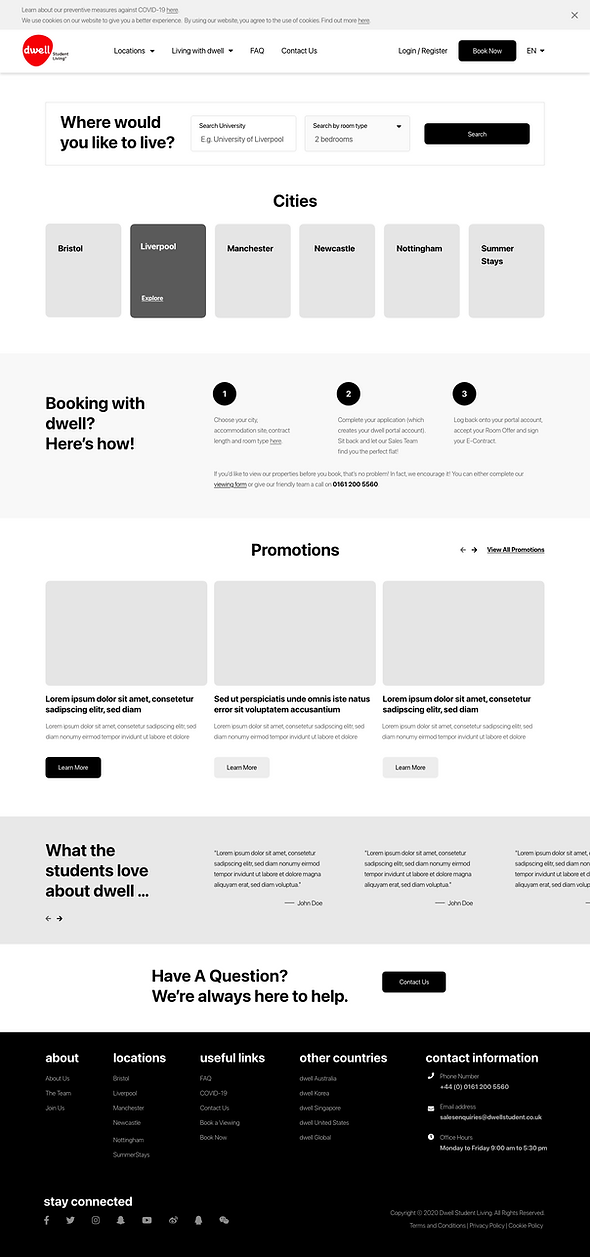
Homepage
-
Information on landing page is reduced and focuses on what the users are looking for (based on survey results).
-
The menu bar is simplified to the most accessed items on the website, reducing cognitive overload.
-
Searchability increases with a key in search filter by the university and/or room.
-
Visual CTA buttons for users to view accommodations through desired cities. This is to cater to users who are not yet sure of their attending university and room type but know where they want to reside.
-
The information hierarchy of the page is determined through what the users have deemed important (based on survey results).
-
Footer with full sitemap access to all available pages and links on the dwell UK website.
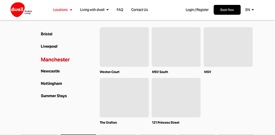
Homepage — menu drop down
-
To browse, users will be able to hover over locations on the menu showing a list of their desired cities along with a visual selection of available locations shown.
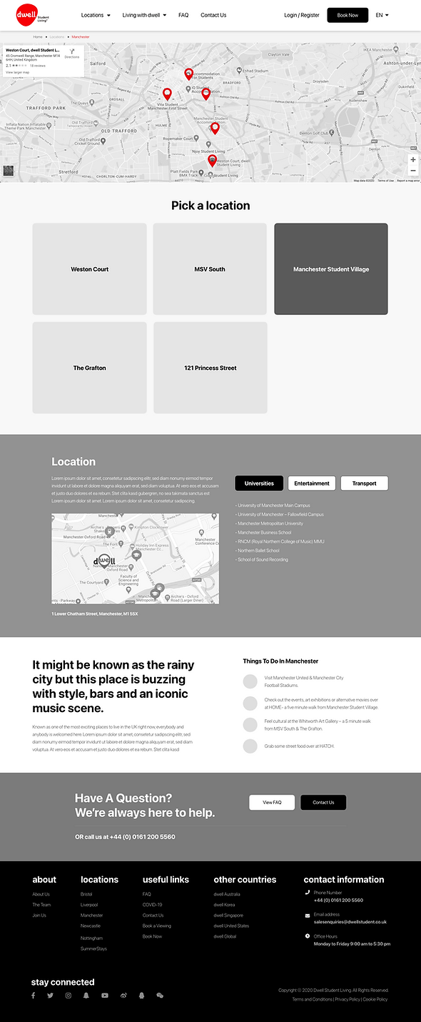
Cities
-
Cities can be accessed through menu drop-down under Locations or above the fold on the Homepage. This is a wireframe for Manchester.
-
On this page, users will be able to view all the available accommodations in Manchester through a map. This gives them a visual indicator.
-
For the decisive users, they are given a choice to pick their desired location, otherwise, a scroll down will showcase a list of information and benefits of the city so they can better make a comparative decision.

Location
-
An initial concern on this page was that there would be too much content to present. Therefore, a fixed sidebar navigation was introduced so that users don't feel inundated with information. This side bar will allow them to select the desired information and scroll directly to the content.
-
The contents were sectioned according to the importance and laid out to be as clear as possible to reduce confusion.
-
To aid in browsing, the last section has been designed to guide users to explore other accommodations in the same city.
[ Develop ]
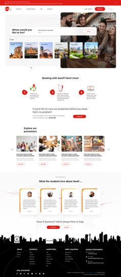
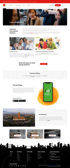
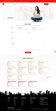
High-fidelity mockups
After the wireframes were approved and has a 90% confirmation on lay out, the next stage was to come up with the mockup to compliment the skeleton.
Tool(s) used: Adoble XD & Adobe Photoshop







Deliver
[ Deliver ]
Hand-off
Rapid prototyping and Usability Studies were omitted as this project had a tight schedule. The specs and design files were handed off to the developers for website development.
[ Take Aways ]